|
By Julee Klein, Marketing Consultant & President
12 Key Elements Your Website Homepage Should Include
A great website homepage is built with intent and designed to serve different audiences. Think about how and why visitors may come to your website. There will be those seeking to find a solution to their problem, hoping your product or service does the trick. But there will be visitors who are still researching and gathering information as well. Your homepage will also need to help job seekers, vendors, and potential business partners find their way around, too.
A great homepage incorporates elements that will attract traffic, educate a variety of visitors, and invite conversions. These elements move visitors from "just looking" to completing their desired task and submitting a contact form and becoming a lead. Or if you're selling online, these elements will help shoppers with completing a sale and becoming a customer.
To improve the performance of your homepage, check out the following infographic from the folks at HubSpot that visually details 12 critical elements every small business homepage must have. We offer some additional information and tips below the infographic as well.
Additional Information and Tips for Homepage ElementsCreate headlines and subheads that pass the test.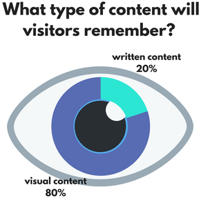
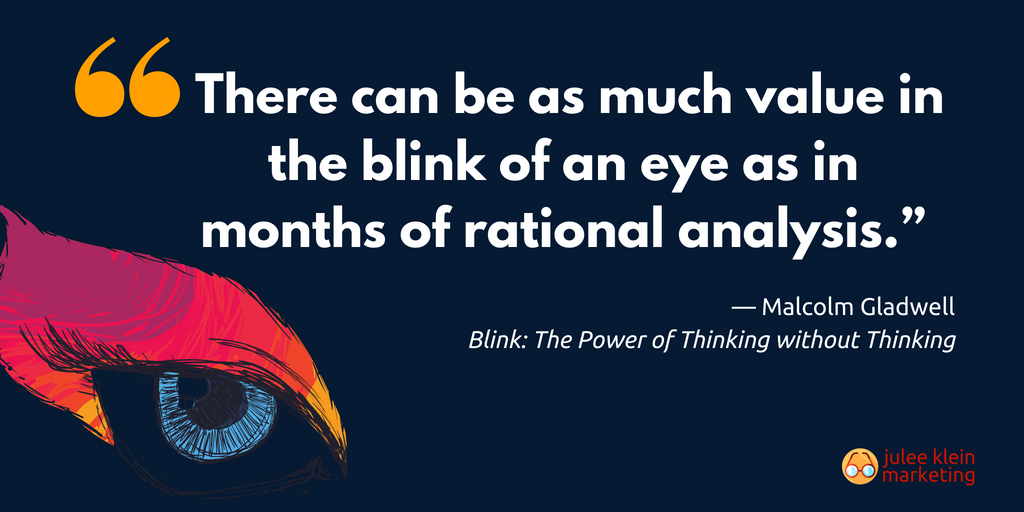
There's a principal in web design called "the blink test." Marketers are taught to consider the commonly held belief that once a visitor lands on your website they will take only 3 to 5 seconds to judge it and decide if they want to explore the site further or abandon the page. So maybe you get two blinks for your content to be considered if you're lucky. But...
The time it takes for visitors decide to stay or bounce may even be less. In a study conducted by Carleton University (Canada) in 2006, researchers found then that marketers had only 500 milliseconds (i.e. half a second) to impress and engage a first-time visitor. Maybe they were just looking at dysfunctional websites? It was 2006 after all. Regardless, your headline and subhead need to quickly come to the point, help make your mission, product, or service-offering more clear, and inspire further exploration. The homepage is not the place for jargon or lengthy copy. Call your users to action.
That's the goal of your home page - to move visitors through your funnel to the page or contact form that is most helpful to them and allows them to take action. Your primary calls-to-action (CTAs) should act as wayfinding guide posts so visitors can quickly (blink) determine where they need to go to complete their task or find the information they're looking for.
HubSpot recommends including "two to three calls-to-action above the fold that direct people to different stages of the buying cycle - and place them in spots that are easy to find." They also recommend that CTAs are short, three to five words, and are action-oriented. For visitors who are gathering information, a good CTA may be "Get our free report." For those further along the buyer's journey, "Try it for Free" or "Sign up" may be appropriate CTAs. Other tips for CTAs: make sure they are visible with either ample white space or sufficient contrast around your calls-to-action and double check to see how these appear on a mobile device and tablet. What may be large enough to provide a good user experience on a desktop may be frustratingly small on a smartphone. Homepage Images = Eye Candy In 2015, Twentieth Century Fox teamed up with iStock by Getty Images to create a set of parody stock photos featuring Vince Vaughn and Dave Franco to promote the film Unfinished Business. In 2015, Twentieth Century Fox teamed up with iStock by Getty Images to create a set of parody stock photos featuring Vince Vaughn and Dave Franco to promote the film Unfinished Business.
Your homepage "hero image" is going to speak much louder than your words. Images that capture emotion and inspire action are always going to perform better than cheesy stock photography.
If you've spent any time on the internet you've seen that the web is lousy with cheesy stock images (like the image at right) that we're convinced never survive the blink test - unless they contain photoshopped celebrities. Stock images aren't all bad, particularly if you don't have the budget for a custom photoshoot. When pouring through stock images, look for interesting angles, close ups, and creative lighting. Look for ways that you can crop in on a section of an image to give it greater drama and interest. Find an image you like of the perfect subject matter but it's not quite right? Expand your search selection to include other images from the same shoot by the same photographer. Consider SEO when it comes to your images. Page load times matter to Google and other search engines. So does being optimized for mobile. So err on the side of caution and be sure to compress the file size of your high quality images. Some website builders and plug-ins will do this for you, but there are tools available online like TinyPNG where you can simply upload a file to compress. One last image SEO tip: don't forget to add alt text to your images. Everyone needs validation, so offer social proof.
Any claims you make or benefits you state on your small business homepage are going to be much more convincing if you pair them with short testimonials and/or case studies. Include just a few of your best, short customer quotes on your homepage. If you can include an image alongside your customer quotes they'll be even more compelling. If you have a compelling case study or customer success story, include a link to it as one of your CTAs.
Navigation is everything.
Nothing is going to undermine your great homepage design and other important page elements more so than a poor navigation experience. Your site navigation should offer a clear path for visitors to take to engage further with your web content. Otherwise if they are confused about where to go next they'll bounce. To decrease your website bounce rate, Hubspot recommends web marketers "make the navigation menu visible at the top of the page, and organize the links in a hierarchical structure." If you can, add a content search box. Alot of website builders now offer these and plug-ins are available to add this feature as well.
Use content offers as lead magnets.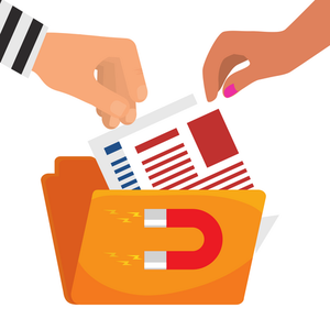
A primary goal of a small business website is to generate leads. A great way to do that directly from your homepage is to feature a really great "lead magnet" content offer such as a whitepaper, ebook, checklist, template, or guide.
Visitors who are not yet ready to buy, but may still be in the consideration stage of the buyer's journey, are more likely to download a compelling content offer that gives them more information about a topic they're interested in. It's a good alternative to a more aggressive "Buy now!" CTA and allows you the opportunity to capture their info as a lead. You'll be able to continue to nurture them via a follow-up email campaign if they've opted in to your email newsletter. The caveat here is that your content offer has really got to be of value and provide helpful information. Resources work wonders.
Offering a link to a resource center from your homepage is a great way to establish credibility in your industry and differentiate from competitors. Those visitors who are not yet ready to buy, but are seeking additional information, can browse additional relevant information that will ultimately help them move further along the buyer's journey and closer to conversion - when they're ready.
Speaking of credibility, include success indicators.
Like social proof, success indicators such as industry or community awards, positive reviews or press mentions, and certifications will help your credibility with those who are new to your small business. Don't be afraid to mention your accomplishments on your homepage and include quotes, badges and/or images.
Depending on the type of award, press mention, or success indicator, the best way to incorporate these may be to feature on a rotating banner or slideshow on the homepage, as a sidebar element, or below the fold (in the bottom third.) Above all, put your users' experience first.
In everything that you do to your website, but most particularly on your homepage, make sure that you're providing a positive user experience. Ask yourself:
Resources:
By Julee Klein, Marketing Consultant & President
Julee Klein is the President of Julee Klein Marketing LLC, a full-service digital marketing agency based in Morgan Hill, California. JKM is focused on serving small business owners in the greater Silicon Valley area. You can get in touch with Julee on LinkedIn, Twitter, Facebook, and Instagram @JKMktg
Editor's note: JKM is a Certified HubSpot Agency Partner proficient in Growth Driven Design and Inbound methodologies.
2 Comments
6/3/2022 02:21:44 am
After all, website homepage design is essential to a site’s success, and this means including all of the key elements from the get-go. Thanks for the great blog! The infographics are amazing and very helpful!
Reply
Leave a Reply. |
klein blog:
|
Services |
Company |



 RSS Feed
