|
By Julee Klein, Marketing Consultant & President
Google recently announced their "mobile-first" indexing. Is your website ready?
Any time Google makes a change to the way websites are indexed and ranked, feathers get ruffled and there's a bit of a "the-sky-is-falling" response. But no need to fret. With every change to made by Google, we've actually seen opportunities and improvements that deliver better results and better user experiences for consumers. So change is good.
That said, this means that there's some new attention to be paid to your website to ensure that you're truly optimized to reap the most benefit from this latest decree from the Googledom. Is your website truly a mobile website?
Well, which kind of mobile? It turns out there are actually a number of ways in which your website can be configured to be rendered on a mobile device. Here's how Website Magazine breaks it down:
Mobile Friendly - A website that shows the same page on every device, at a different scale. Think of this as automatically zooming in and out or shrinking to a page. Mobile Responsive - Your website presents itself differently based upon the screen size of the device it is being loaded on. This can include changing the page, removing certain elements, and making some elements larger or smaller on a page depending on the screen size of the device. Mobile First - This is a less discussed method of building a website, but can be highly effective for websites that rely heavily on mobile visitors. A mobile-first site is designed primarily for small screens and adjusts to also display well on desktops. Both responsive and mobile-first sites adjust based upon the viewer's screen size. Mobile first sites are created to display on phones and modified to look good on desktops. Whereas mobile responsive websites are designed for desktop and modified to look good on smaller screens. Don't panic. There's time to get "more mobile."
Luckily, Google is taking things nice and slow and the new index will touch upon those websites that are already following best mobile practices. So those who haven’t gone completely mobile have some time to adapt to the New Mobile World Order before Google's full roll-out is completed by Fall of 2018.
How do you know if your website is affected?
According to SEMrush, "a notification in Google Search Console will let website owners know if their site has been affected. Google confirms sites that are subjected to the new mobile indexing will not yet have any advantages over the 'old' ones." Key word here is "yet" and the important takeaway is that Google seeks to underscore the point that going mobile is always the best approach even if your website won’t get outright penalized for not being truly mobile.
Why mobile? Does it really matter for my small business?
Yes. Data-driven Connext Digital reported that nearly half the world now accesses the Internet via mobile devices and in the United States alone, about 77% of the population are smartphone owners. And where users go, marketers follow. So much so that about 63% of global digital advertising budgets are expected to be spent on mobile this year. So it stands to reason that Google should give more weight to mobile-friendly sources and content.
When you think about your small business, local search is critical. If 50% of your potential customers are looking for your type of business in your area while on their phone, you'll want Google to return your website as a top result. Equally important: you'll want to provide a great user experience when visitors land on your site on their mobile device. The net/net is: mobile search often leads to more immediate sales. Need more convincing? Check the stats on mobile advertising.
Here's the full infographic report form Connext Digital:
Mobile website first. Mobile advertising second.
You can see where this is leading. The future is mobile. Mobile marketing is one of the most important digital advertising and marketing trends today. So as a small business, first let's ensure we're satisfying the new market conditions created by Google's move to mobile-first indexing for websites. Then the next step is to take advantage of the opportunities available with mobile advertising.
Resources
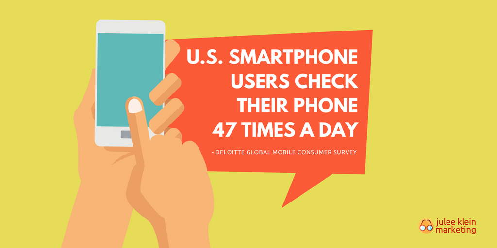
1. Deloitte, Global mobile consumer survey: US Edition
2. Website Magazine, SEO for Mobile Index by Travis Bliffin 3. SEMrush Blog, Google News Digest: The Mobile First Index and Mobilegeddon are Here by David Bain 4. ConnextDigital.com, The Domination of Mobile Ads: Trends and Statistics [Infographic] by Rob FitzGerald Get mobile. By Julee Klein, Marketing Consultant & President
Julee Klein is the President of Julee Klein Marketing LLC, a full-service digital marketing agency based in Morgan Hill, California. JKM is focused on serving small business owners in the greater Silicon Valley area. You can get in touch with Julee on LinkedIn, Twitter, Facebook, and Instagram @JKMktg
0 Comments
Leave a Reply. |
klein blog:
|
Services |
Company |


 RSS Feed


