|
By Julee Klein, Marketing Consultant & President
Customer engagement begins with your logo.
A number of our small business clients come to us because they need a better web presence or want to begin marketing their business online. We hate to do it, but sometimes we have to pump the brakes, take a step back and discuss their branding. For most small businesses, "branding" may consist of their logo and perhaps a small set of preferred colors, and maybe, if we're lucky, some defined fonts and images.
But the importance of your small business' logo cannot be overstated. The logo is often the first interaction and subsequent reaction a new prospect experiences when discovering your business. So the important question is: does it send the message you want to communicate about your company?
How important is your logo design and branding?
Recent marketing research reports indicate that the majority (over 70%) of purchasing decisions are made in-store, and color and aesthetics play a major role. Other marketing studies show that visual elements, like font style, colors, and images illicit emotions and influence online buying behavior and attraction toward a product or brand. There is a whole field of color psychology that focuses on the study of the effects of color on emotions.
And while a number of marketing research firms have delved into understanding the psychology of color as it relates to branding and logo design - the effects are not clear cut (or black and white). A number of other factors, - e.g., cultural differences, personal preference, life experiences, and context - can influence a person's response to color.
The key takeaway is that the phenomena that colors can elicit emotions is real. Therefore, careful consideration to color theory and design should be given to your small business branding and logo design.
The Role of Color in Small Business Branding
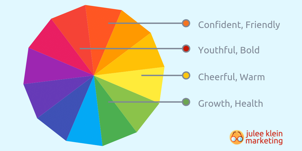
To understand more about the role of color in logo and branding, Market Inspector has put together the following infographic. While it doesn't cover all of the color options possible, it's still pretty helpful in determining what colors and color combinations may be a good fit for your small business - and conversely, why some color combinations may not be the best choice.
The text version of the infographic follows below. All infographic content provided by Market Inspector.
Red Communicates Youthful, Bold, Passion
Red triggers stimulation, appetite and attracts attention. It is often used in clearance sales. Marketers use the active reaction to red to create excitement around the brand. Red can also raise the human pulse rate. Brand examples: H&M, Netflix, Coca-Cola, Nintendo.
Blue Communicates Strength, Trust, and Reliability
Blue creates trust in the brand is a favorite color of most people. It also conveys professionalism and strength. Blue is often linked with curbing appetite and hence, is not used by many fast food brands. Prominent examples: Facebook, IBM, Intel, Ford, and Gillette.
Yellow Represents Cheerfulness, Optimism, and Warmth
Yellow is associated with optimism and happiness. It also grabs the attention of window shoppers and stimulates mental processes. Prominent brands that use yellow: SnapChat, Hertz, Best Buy, McDonalds, and Post-It.
Green Communicates Tranquility, Growth, and Health
Green tends to be favored by brands or products that are eco-friendly. It also conveys growth and is used by financial brands. Green represents health, fertility, and relaxation. The human brain also perceives green to be associated with increased productivity. Brand examples: Starbucks, Land Rover, John Deere, Acer, and Holiday Inn.
Orange Means Confidence, Friendliness, and Enthusiasm
Orange is creative and friendly. It creates buzz and calls viewers to action. Orange is often targeted toward impulsive shoppers. It represents a cheerful and confident brand. Brands that use orange: Nickelodeon, SoundCloud, The Home Depot, Gigamon, Ubuntu.
Neutral Branding Communicates Balance, Calm, and Premium
Neutral colors such as black, white, and gray convey professionalism. Black often signifies intelligence and authority. It's used by brands to maintain simplicity, shows high-quality, and is perceived as a luxury. Examples of brands that employ neutral colors are: Audi, Gucci, Amazon, Hermes, Mercedes, and Nike.
Multi-Color Branding Represents Diversity
Multi-color branding projects diversity. Brands use multi-color logos to stand out from other brands. They use a multi-color pallette to represent different people, countries, and offerings. Often used by internet companies. Examples of multicolor brands: The Olympics, eBay, Google, NBC, and Microsoft.
Other Important Logo Considerations Besides Color
While color is the largest, most important logo consideration there are other factors to consider. Font choices and font styles and other details can affect how your brand is perceived.
While some small business owners may have some impressive creative skills, it's often best to leave final logo design, including font styles and other details, to a professional designer. They're trained to understand important considerations such as how your logo will render in web applications as well as large format signage. You'll want a logo design that looks great no matter where or how you use it.
If you do engage a professional designer or agency to create a logo for your small business, be sure to ask for logo guidelines as well as all of the logo formats you'll need for both web and print applications. You won't want to risk making a bad first impression by using a poor-quality, low-resolution image of your newly designed logo.
By Julee Klein, Marketing Consultant & President
Julee Klein is the President of Julee Klein Marketing LLC, a full-service digital marketing agency based in Morgan Hill, California. JKM is focused on serving small business owners in the greater Silicon Valley area. You can get in touch with Julee on LinkedIn, Twitter, Facebook, and Instagram @JKMktg
7 Comments
2/11/2021 04:21:17 am
Very nice article. This blog is really helpful to me as I want to discover more about logo designing. Would love to read more form you in future. Keep sharing!
Reply
While creating a logo, color is the most important factor to consider. There is different psychology behind every color we used in our logo. A logo is a representation of our brand. So we have to choose the color and the font wisely in our logo. Thanks for this article. Keep sharing more!
Reply
3/7/2022 11:41:11 pm
I very much appreciate it. Thank you for this excellent article. Keep posting!
Reply
6/15/2022 10:19:02 pm
Excellent article. This blog has been extremely beneficial to me as I seek to learn more about logo design. I hope to read more from you in the future. Continue to share!
Reply
9/11/2022 09:52:04 pm
Probably one of the most concise blogs I was looking for to get accurate and relevant knowledge.
Reply
7/4/2024 05:31:59 am
Fantastic blog post on the significance of logo color! It's incredible how much impact color can have on brand perception and customer emotions. Choosing the right color can truly convey the right message about your small business. Thanks for sharing these valuable insights!
Reply
Leave a Reply. |
klein blog:
|
Services |
Company |


 RSS Feed


