|
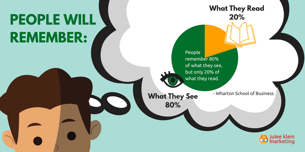
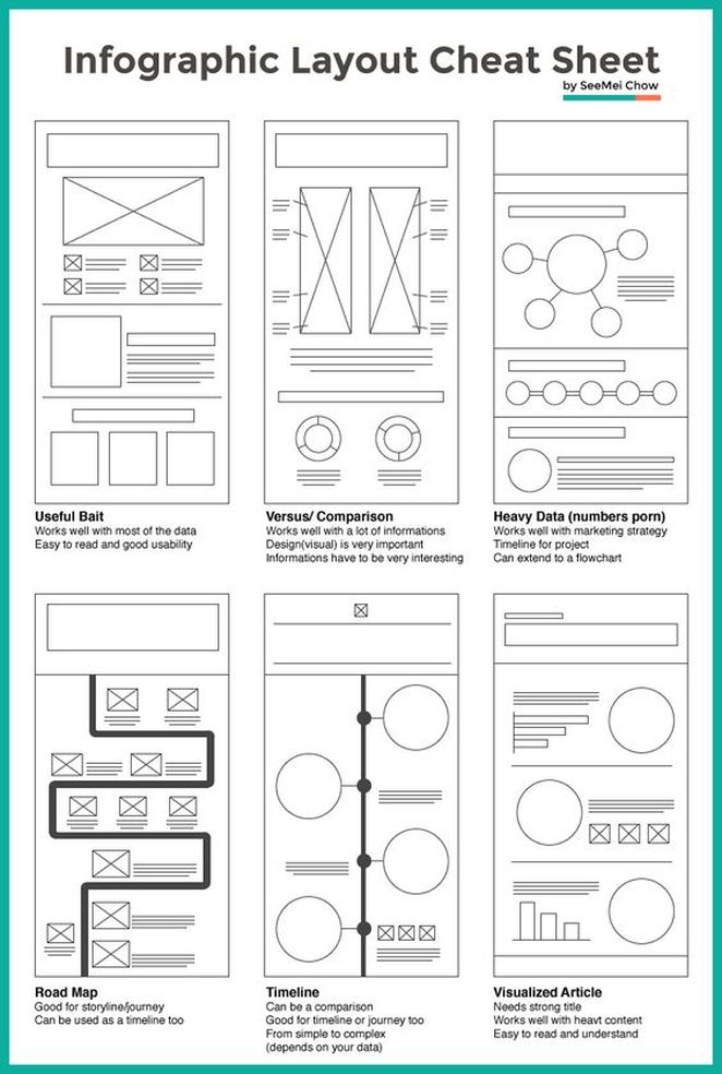
Guest post by Payman Taei, Visme.co Founder Elevate your presentation engagement with complementary infographics.It's no secret that different types of marketing collateral serve very different purposes, particularly when it comes to informing and educating your audience. Sometimes people don't want to read a long piece of content. They'd like to see the same information expressed visually in the form of an infographic, presentation, or even a video. Let's face it, recent studies show that these types of visual content typically outperform more traditional forms of marketing communications. An infographic created with a tool like Visme and a presentation or video aren't that different in the grand scheme of things. In fact, there's a lot to be said about going out of your way to make sure that an infographic does not simply act as a replacement for something like a presentation, but that it actually complements and helps elevate the amount of engagement that presentation could generate on its own. If you truly want to create an infographic that complements an existing presentation (or vice versa), there are a few key things to keep in mind. The Art of Complementary Collateral: Breaking It DownOne of the most important ways to make sure that you're creating an infographic that actually complements your presentation is to dive deeper than just the message you're trying to convey. Think about all of the design choices that you made with the presentation in terms of things like visual communication, language, pace and even tone - then determine which elements you can repurpose into the Infographic. Pace is incredibly important in terms of presentation design. People will have no problem sitting down and going through a longer presentation if it has its own strong sense of momentum - if each slide naturally builds into the next. The infographic you design should communicate the same sense of pace. If your presentation was slow and methodical, your infographic design should follow suit. If your presentation was fast and furious, the same "pace" should be implied and communicated via your infographic design choices. This way, both pieces of collateral aren't just offering complementary information, but a complementary experience. They don't just feel like they're coming from the same place from a brand continuity perspective, but they also feel like they're telling their own parts of a larger and more important story. Equally important is the idea that you're using each format to make up for certain natural disadvantages inherent in the other. There are certain things that a presentation can do that an Infographic cannot and vice versa and with the right perspective and approach, you can absolutely use this to your advantage. Consider the example of a presentation and an infographic that both talk about certain charitable contributions or community outreach efforts your brand has recently made. You might use the presentation to dive deeper into the actual, tangible effects that those efforts had. You could outline all of the local challenges you helped solve or the emotional, earnest ways that your efforts actually made a difference. You wouldn't necessarily want to fill the presentation itself with statistics, as they're naturally a bit cold and calculated. In a situation like an event where a presentation is given, you're trying to generate as much emotion as possible. Therefore, hard numbers may make things seem like you're saying "Look at me! Look at what I did!" as opposed to what you want to say, which is "Look at the difference we made together." Too many statistics in a presentation can keep the reader or audience member at a distance. A complementary infographic, on the other hand, would be the perfect place for those stats since the format itself is so powerful in terms of visual communication. The presentation would let you totally control the emotional aspect of the narrative, while the infographic can provide credibility and the deeper-dive into specific information to those who want that level of detail. If someone only saw only the infographic they would still know exactly what you did and could make their own determinations, but by viewing both pieces of content they get a complete picture in a way that is both emotional and credible. If you truly want to create two distinct assets that offer complementary experiences, you'll need to avoid a few key traps.While there will certainly be a bit of overlap in terms of the information that you're providing, you want to take care to ensure that your infographic is not just a carbon copy of your presentation in a different format. Doing so would make the infographic largely redundant and diminish its overall effectiveness. Don't just take one slide from your presentation and turn it into a bullet point on your Infographic. Really think about the message beyond the slide itself and figure out what you can add to it when moving it into an infographic format. Strengthen your efforts through complementary content.In the end, creating an infographic that complements your presentation (or vice versa) goes a long way towards acknowledging something very important in the world of marketing: every piece of collateral that you create is just one small part of a much larger whole. Making an effort to create complementary materials doesn't just go a long way towards guaranteeing that your message is received in the way that you need, but it also helps strengthen critical ideas like brand and voice continuity across the board. Complementary content also allows each piece of collateral to become something much larger than it could be on its own. If a chain is only as strong as its weakest link, going out of your way to create complementary content goes a long way toward ensuring that every last link is as strong as it can possibly be. No exceptions. Guest Post by Payman Taei, Visme.co Founder Payman Taei is the founder of Visme, an easy-to-use online tool to create engaging presentations, infographics, and other forms of visual content. He is also the founder of HindSite Interactive, an award-winning Maryland digital agency specializing in website design, user experience and web app development. Editor's note: JKM is not an affiliate of Visme nor HindSite Interactive and has not received compensation for publishing this guest post.
0 Comments
Leave a Reply. |
klein blog:
|
Services |
Company |


 RSS Feed


